Microsoft unveils a new "human-centric" Start Menu redesign for Windows 11

Alfonso Maruccia

Posts: 1,734   +514
Staff
Editor's take: Starting with Windows 8, Microsoft has repeatedly mangled the tried-and-tested Start Menu paradigm – achieving absolutely nothing useful each time. Now, the AI and cloud corporation is at it again. Maybe it's finally time I consider buying a Mac…

A new wave of design experimentation has arrived, and Microsoft seems eager to use it as an excuse to rebuild everything from the ground up. It started with the Start Menu – Microsoft's favorite test subject whenever it sets out to "reimagine" something the old guard had already perfected decades ago.

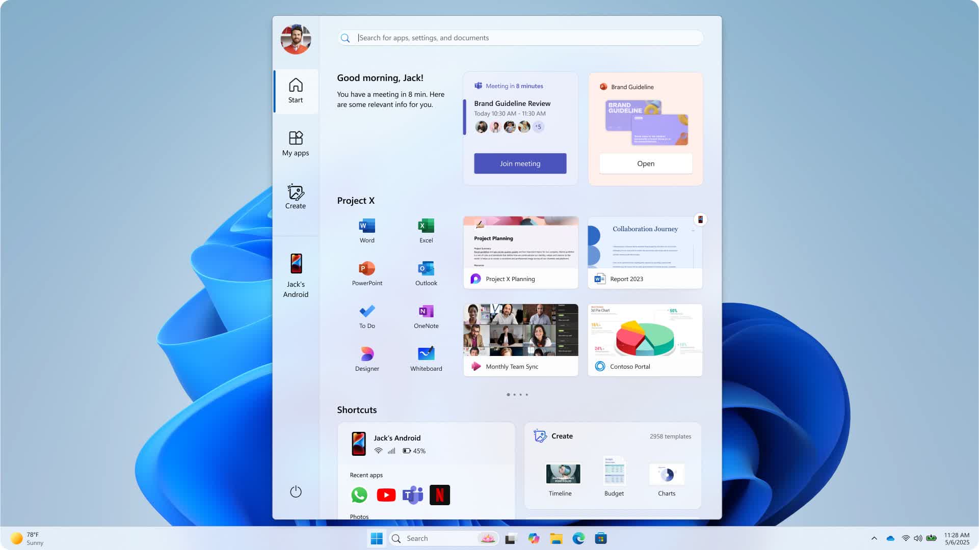
The Windows Design team recently detailed its Start Menu overhaul on the Microsoft Design website. The team claimed it aimed to preserve the menu's core purpose – helping users find apps and content easily – while also letting it "breathe" because, in 2025, functionality alone apparently isn't enough.

The team followed four distinct "guiding stars": Apps at a Glance, Make it Yours, Accelerate the Day, and Honor the Icon. Windows users should have quick access to their entire app library and customization options, while the interface should streamline routine tasks and respect three decades of muscle memory.

This is the final revision of the new Windows 11 Start menu:

Microsoft designers collaborated with over 300 Windows 11 "fans" through several unmoderated studies, gathering feedback to help refine their original goals. The upcoming Start Menu redesign promises easier app discovery, more logical suggestions, greater control, and a clear distinction between desktop and mobile content.

The developers created three "All Apps" views, including a category-based grid highlighting frequently used programs. Microsoft says recommendations now adapt to user behavior in real time and offer options to hide less helpful suggestions. The team tested the new Start Menu across various devices and form factors, from the Surface Go to a 49-inch ultrawide display.

"We sweated every pixel to make sure it needed to be there and to ensure the experience was filled with grace and ease," the blog post read.

The "fresh Start" envisioned by Redmond's designers features dynamic recommendations, an improved view for all apps, and behind-the-scenes enhancements to UI performance. The company continues to gather user feedback, claiming that "design is a conversation, not a monologue."

On a more personal note, I still find the entire Windows 11 UI concept – and the ongoing Start Menu redesigns since Windows 8 – to be absolutely hostile to everything I need to do on my PC.

Microsoft seems desperate to hide the fact that it's selling a computer operating system, not an inspirational manifesto for mobile device experimentation. Luckily for people like me, third-party applications like Open Shell will always come to the rescue. Because that's the nature of the (Windows) beast – whether Microsoft likes it or not.

Permalink to story:

 
People use the start menu? Pins and win+s are how I launch my programs. I never even see the actual start menu.

Lock with win+l

Log off, switch user, sleep, restart, power, etc with just a right click on the start button.
 
People still use the start menu? What do they actually use it for? I have everything I need pinned to the taskbar. And if I don't I just type in the first few letters of the app I'm looking for and go. I have a simple shortcut to a log-off script on the taskbar too so I don't have to go through MS's 9327434 clicks and ads to log off.
I use it for extra pins and quick access to different things. I already have too many things open and I don't need to see random applications that I don't use often.

As for shut down, I just right click it to open the context menu.
 
"The team followed four distinct "guiding stars": Apps at a Glance, Make it Yours, Accelerate the Day, and Honor the Icon"

What the heck does this mean? What a crock of crap.

How about don't make the start menu look like a web page, and instead just make a simple listing of folders and subfolders of shortcuts like it used to be. Anything I need on a regular basis is already on the Windows 7 quick launch bar anyhow.

I really do not like Microsoft anymore.
 
UX Designers are full of ****. If you did holistic user research instead of just presenting 10 bad options and they pick the least bad, then you'd have people like us heard.
 
People still use the start menu? What do they actually use it for? I have everything I need pinned to the taskbar. And if I don't I just type in the first few letters of the app I'm looking for and go. I have a simple shortcut to a log-off script on the taskbar too so I don't have to go through MS's 9327434 clicks and ads to log off.

Yeah, I use it for several reasons, many times a day. It's a power-user Start Menu, though, and I refuse to pin hundreds of different utilities and programs on the f****ng Taskbar :-D
 
People still use the start menu? What do they actually use it for? I have everything I need pinned to the taskbar. And if I don't I just type in the first few letters of the app I'm looking for and go. I have a simple shortcut to a log-off script on the taskbar too so I don't have to go through MS's 9327434 clicks and ads to log off.
I use the start menu for less frequently (Weekly), used apps to easily call up. The Taskbar contains my go to apps which are heavily used almost on a daily basis. Less clutter.
 
Before this nice new actually designed by real people desktop, which I have not seen yet, I find it ten times faster to simply type the name of the program I want into the search bar, rather than sliding my mouse around and clicking several times. And this is supposedly a "graphical" user interface. Seems more like DOS command line to me. Gee, if this design is "human centric", what sort of centric is the original Windows 11 desktop design?
 
On Linux you chose your desktop environment. There are for all tastes, from ultra lightweight keyboard driven to crazy effects. Freedom changes the experience and doesn't turn the user into a passive, hands-tied recipient.
That's all great if you want to occasionally go back to the command line (and don't tell me Linux never uses a command line) and you never need any Windows Only programs (I.e. MS Office is still the standard and Open/LibreOffice is a half a**ed stand in. Not to mention things like Quicken, Taxes (pick your flavor), and dozens of other Windows only programs. There's a reason Linux hangs around 1% of total users despite its lower hardware requirements (or so I've heard) and total lack of pre-built hardware.
 
That's all great if you want to occasionally go back to the command line (and don't tell me Linux never uses a command line) and you never need any Windows Only programs (I.e. MS Office is still the standard and Open/LibreOffice is a half a**ed stand in. Not to mention things like Quicken, Taxes (pick your flavor), and dozens of other Windows only programs. There's a reason Linux hangs around 1% of total users despite its lower hardware requirements (or so I've heard) and total lack of pre-built hardware.
You nailed it. Been saying so for years. People touting Linux have never gone through what it takes to move Windows apps and data to compatible Linux apps, if they even exist.

Not sure how well WINE works any more. but I'll bet that activation of Microsoft 365 or Adobe Acrobat to run under WINE could be problematic.

As a small side project for which I will be paid, I have set up a really good old Lenovo Thinkpad with high-res screen, i7 CPU, 32GB and 500GB SSD just to see what I can do with it. The acid test may well be running Microsoft 365 (web-based version) on it. And it will help me to learn more about Linux. I use Linux Mint Cinnamon regularly as a hardware diagnostic.

But, you know, as more and more software becomes web-based, the less important the operating system is.
 
Back
OSZAR »